
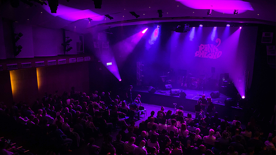
Pink Phloyd are Hong Kong’s premier tribute act to the legendary Pink Floyd. The band is composed of Alastair on drums, Erica (backing vocals), my old chum Greg on lead guitars, Jim on saxophone, Joey (lead vocals and second guitar), Kenny (keyboards and second vocals) and MG on bass.
I’ve known Greg since 1978, and in 2017 he asked me to design the band’s artwork. Initially we looked at a remaster of the 1973 logo. Soon after we tackled the 1977 version, and expanded into localised album cover remasters and associated promotional images. The band regularly gig at venues in Hong Kong, in support of Kely Support Group. Sadly, since COVID19, social distancing means the band cannot play together or perform for the present time.
Find the band on Facebook and Instagram.
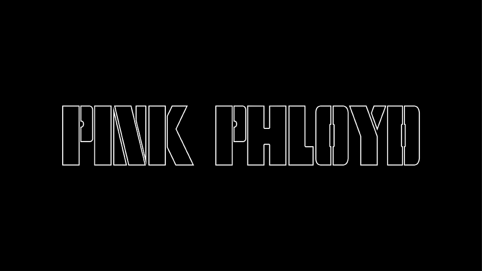
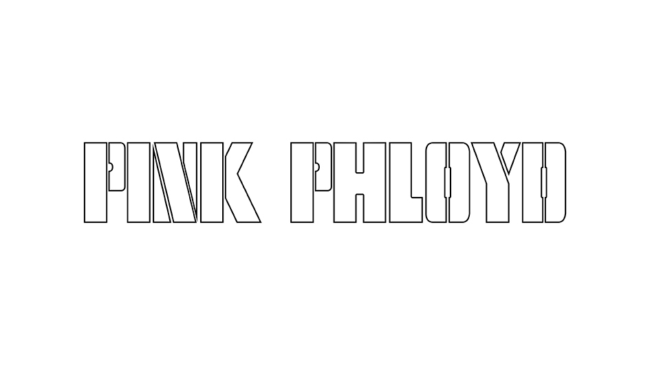
The 1973 logo
The original 1973 logo, redrawn for Pink Phloyd. Use the slider to reveal the logo as seen on stage.
The 1977 logo
The 1977 “Animals” era version of the logo. Use the slider to reveal the logo reversed out of black.
Wish You Were Here
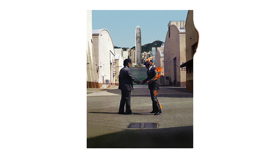
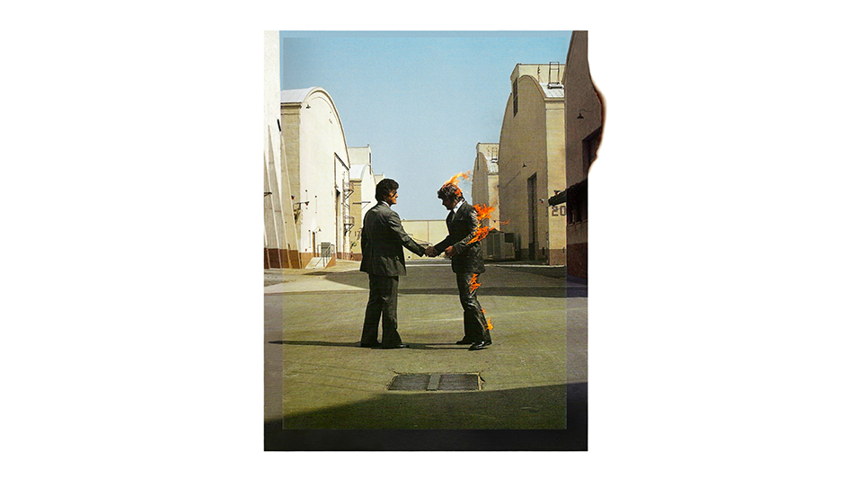
Localised remaster of the Hipgnosis album cover
This remaster threw up some interesting challenges. I only had access to two useful scans of the original artwork, one from a book and one found online, and neither of them were consistent with each other, or blemish-free. The online version was correctly colour-graded and had virtually all the content, including the burning edge at the top right corner, but was small and in low resolution. The other was scanned in high resolution from a large book of album covers, but was cropped well within the original borders so it wasn’t complete. It was also geometrically different due to the shape and thickness of the book it was scanned from, and was printed with a coarse dot screen and severe bias towards yellow, both of which had to be fixed before work on the new composite could begin. To give it the required local customisation I was asked to remove the blue sky background and replace it with a photo of the Hong Kong city waterline.
The two sources for the original album cover required compositing and stitching back together, patching areas of detail which were damaged or missing. The two newly positioned and undistorted sources were then colour graded on separate layers to establish a cooler and more consistent overall palette closer to the original album, removing the yellow bias and fixing saturation problems and inconsistencies in brightness. The sky was then punched out and a new background photo was dropped into place, and the sky was soft-wiped back into position. Careful attention was paid to the flames, creating soft edges to achieve a seamless blend with the new background element. Finally, the area outside the remastered artwork was cleaned back to pure white to remove any blemishes and inconsistencies in tone, and prepare it for the promotional posters. Use the slider above to reveal the remastered artwork.
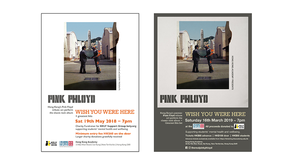
Gig posters for Wish You Were Here, performances of the entire album plus greatest hits.
Dark Side of the Moon
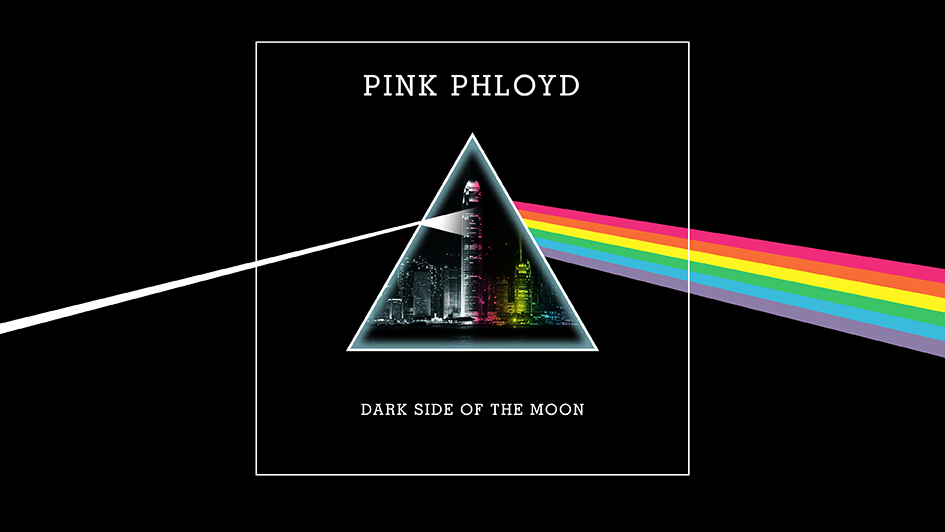
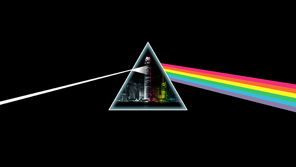
Localised remaster of the Hipgnosis album cover
Based on what’s probably the most famous album art ever made, the brief was simple: add a detail from the Hong Kong city skyline inside the prism, adjust the rainbow colour palette to slightly distance it from the Hipgnosis original and overlay the refracted rainbow onto the city buildings to help it blend together.
The finished artwork was a great success, and was used on many items, including posters, tickets, beer labels, tee-shirts, Access All Areas passes and animated social media image stings. Use the slider to reveal the remastered album cover layout superimposed onto the new artwork.
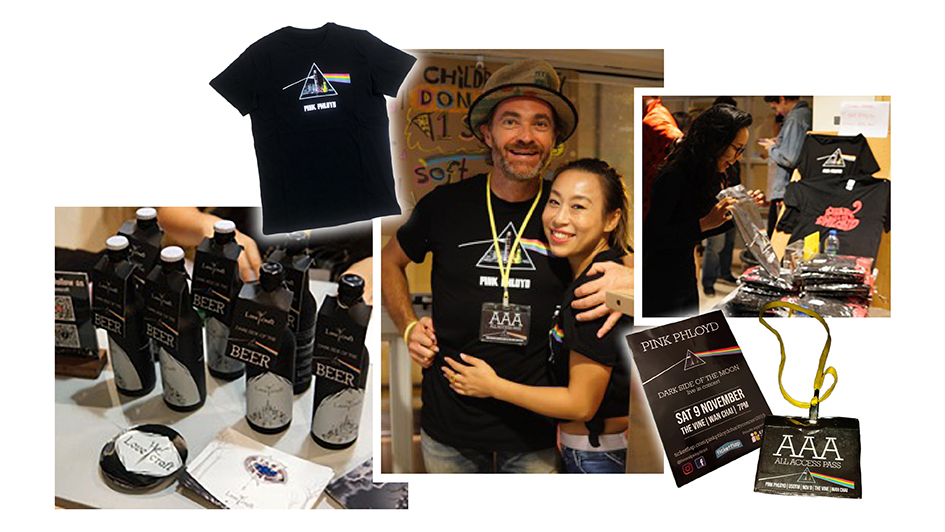
Dark Side of the Beer labels, tee-shirts and Access All Areas passes, more tee-shirts on the merch stand and promotional gig posters.