Tim Pieraccini is an independent filmmaker who lives and works in Brighton. We go all the way back to 1992, having met through local sci-fi fandom, and we’ve kept in touch ever since. In recent years Tim has been working on books and short stories, having previously worked on independent film projects. He wrote, directed, photographed, edited and published these films himself, and through the Brighton Filmmakers Coalition. I’ve designed book jackets and promotional flyers, along with posters, IMDB art and DVD packaging for two of his most recent films. Learn more about Tim’s writing, including his new novel No Way to Beehive: The Story of The Sweet Pills, at his website.
The Story of the Sweet Pills’ book jacket (2026)
No Way to Beehive: The Story of The Sweet Pills is a fictional biography of a successful 1960s rock band. Tim commissioned me to design the cover for this book, using studio photos he took with a group of models representing the band. The image library was extensive, and Tim chose this photo, as it summed up everything he wanted the cover to show.
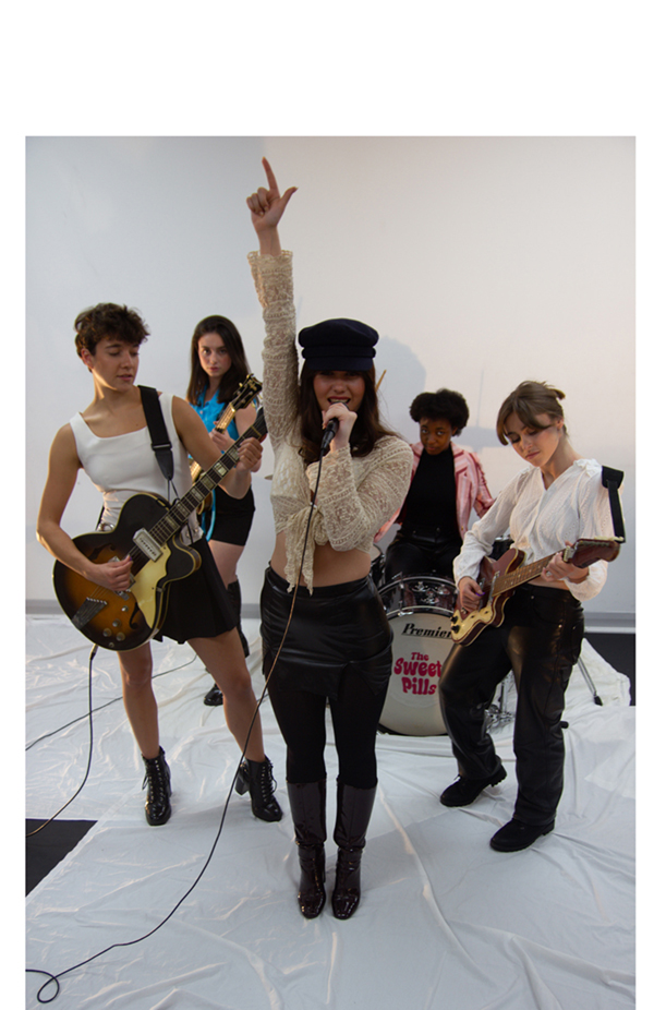

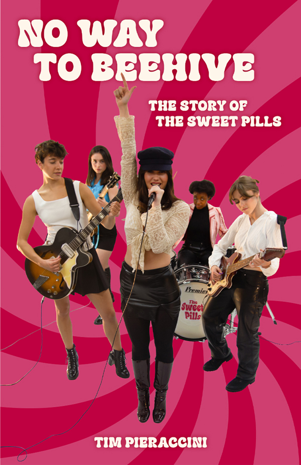
Click on an image above to open up a gallery – tracking through each image reveals the changes made to prepare it for the final cover.
This project had several challenges to work through. The main ones were the cropping of the group from the studio background, with subsequent colour grading, minor repairs to certain sections, and the addition of a new background image to complete the composition.
The photos were taken in RAW format, the digital equivalent of a traditional negative, and the file, whilst a little on the darker side, contained all the detail we needed. The initial grading was done in Adobe Camera RAW before any other work was done, which enables changes to the white balance, colour and brightness. The grading was further improved using the standard Photoshop tools, with work on the levels, saturation and temperature, removing the gloominess from the shadow areas and brightening up the picture.
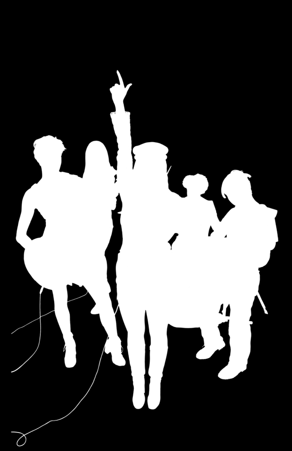
Photoshop has moved on a lot in the years since I started doing this kind of work. We agreed that we wouldn’t use any generative AI imagery to carry out the restoration, so machine learning would be confined to Photoshop’s subject selection tool which, in its cloud setting, is extremely powerful compared to the local version, and shaved off many days of hard graft. The bulk of the work went into refining the layer mask by hand, defining shapes where the automation was unsure, and cleaning up the edges as crisply as possible. Hair has always been trouble for manual masking, but the tools did a great job with the subtleties, much better than my previous efforts.
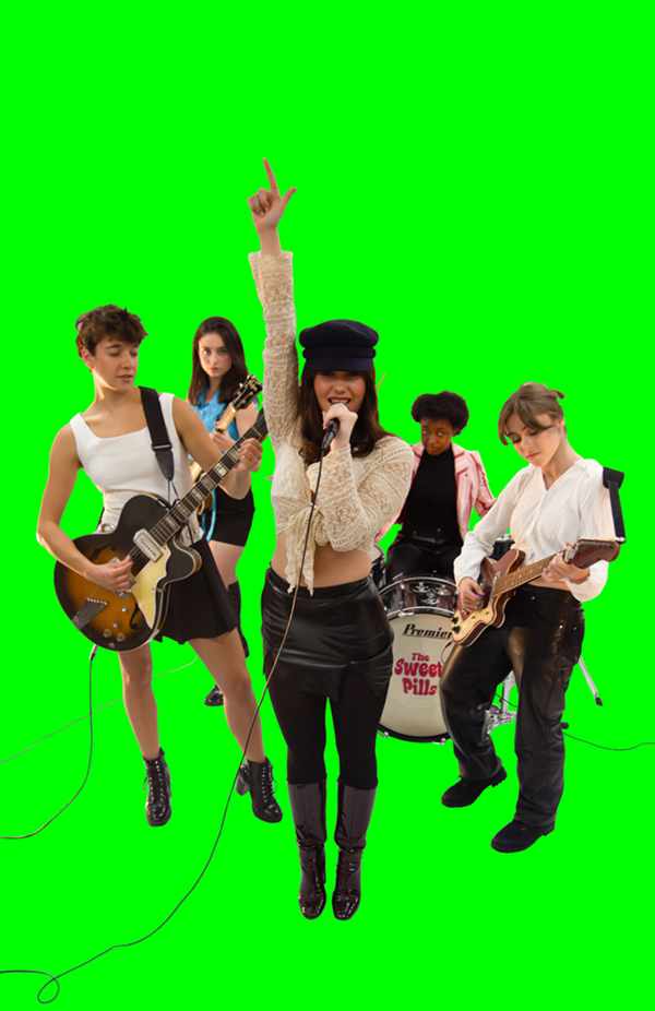
Minor tweaks followed, including repairing floor details where the fabric backdrop had ridden up with movement, obscuring the base of the drum and part of Audrey’s boot. The drum was fixed with a cleaner photo taken from a similar angle, and the boot was fixed with some manual cloning and shaping. A cable was added to Catherine’s guitar, and all the cables were extended to widen the composition boundary. You’ll notice the green background in the images above. I often use this technique, as it gives me a good view of how the mask is working. The majority of any missed areas can be cleaned up later in the mask preview.
Finally, a funky psychedelic background, coloured up to match the band’s magenta logo, was added to enhance the 1960s atmosphere, and add a focal point. The completed image was then dropped into the front cover template, added to the spine and in repurposed in publicity images and flyers.
No Way to Beehive: The Story of The Sweet Pills is available now from Amazon in paperback and Kindle editions. When you buy a copy please leave a review for Tim, and tell your friends about it.
All Heart (2013)
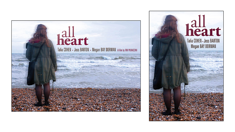
Poster and IMDB bumper.
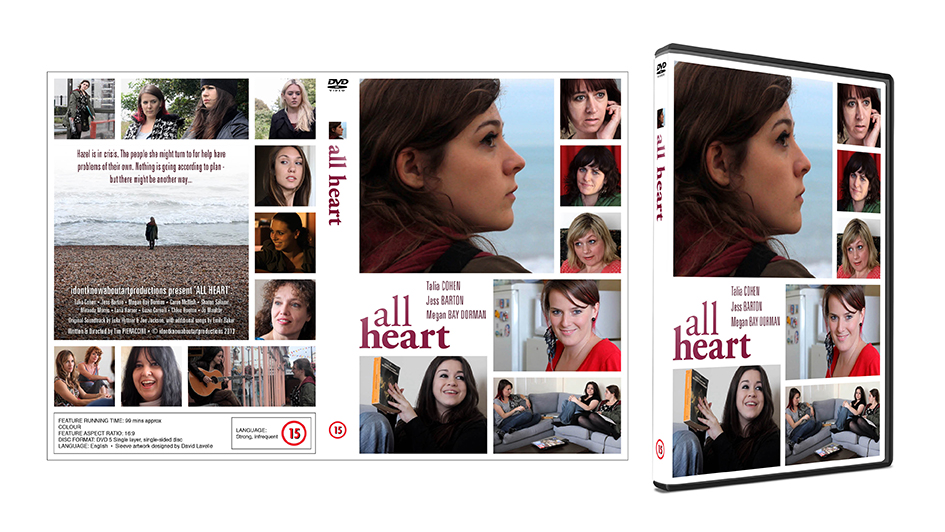
DVD packaging
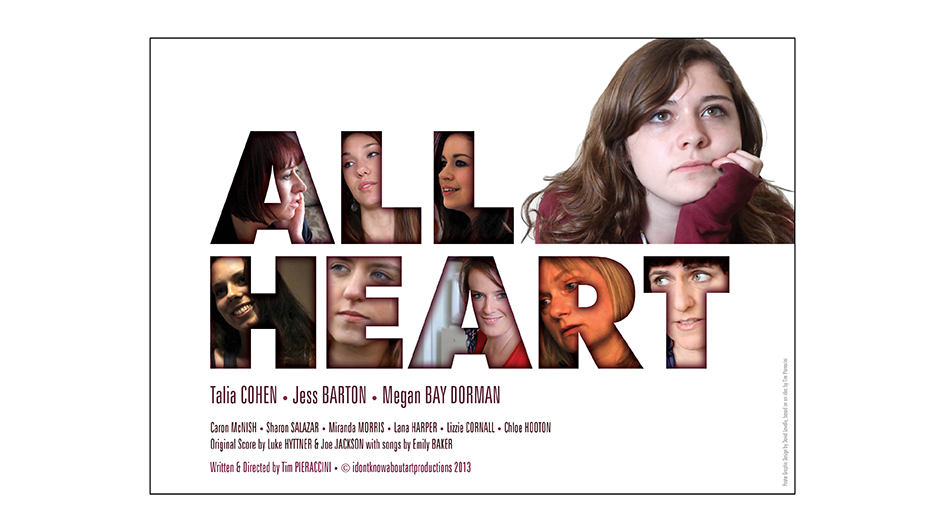
Alternative poster
All Heart is a feature-length movie Tim shot in and around the Brighton area. It’s been shown on Latest TV, and in 2016 Tim published it on DVD. While we were putting together the main poster Tim had another idea in mind: his cast positioned in each letter of the title. As with Hello (below) we made extensive use of HD screenshots to make each character fit the spaces in the letterforms. Both posters are so different to each other, so why not have both?
Tim kindly left some feedback on LinkedIn about our collaboration on All Heart.
“I employed David to work on poster design for my feature film, All Heart. Both pieces he produced exceeded my expectations, given the time available to him and the scanty resources I was able to provide. In the second case especially he took a difficult concept and realised it perfectly.”
Hello (2011)
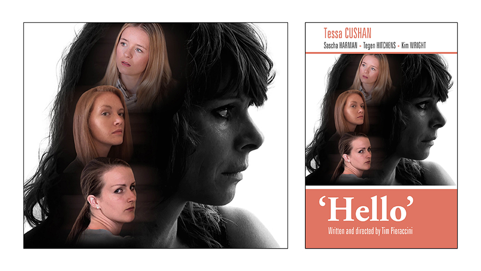
Poster and IMDB bumper.
This composition was created entirely from HD screenshots from the film footage. Tim usually has a specific image in mind for his posters, so finding ways to bring the idea to life is part of the brief.